
Q
Can giving a gift also serve as a criticism?
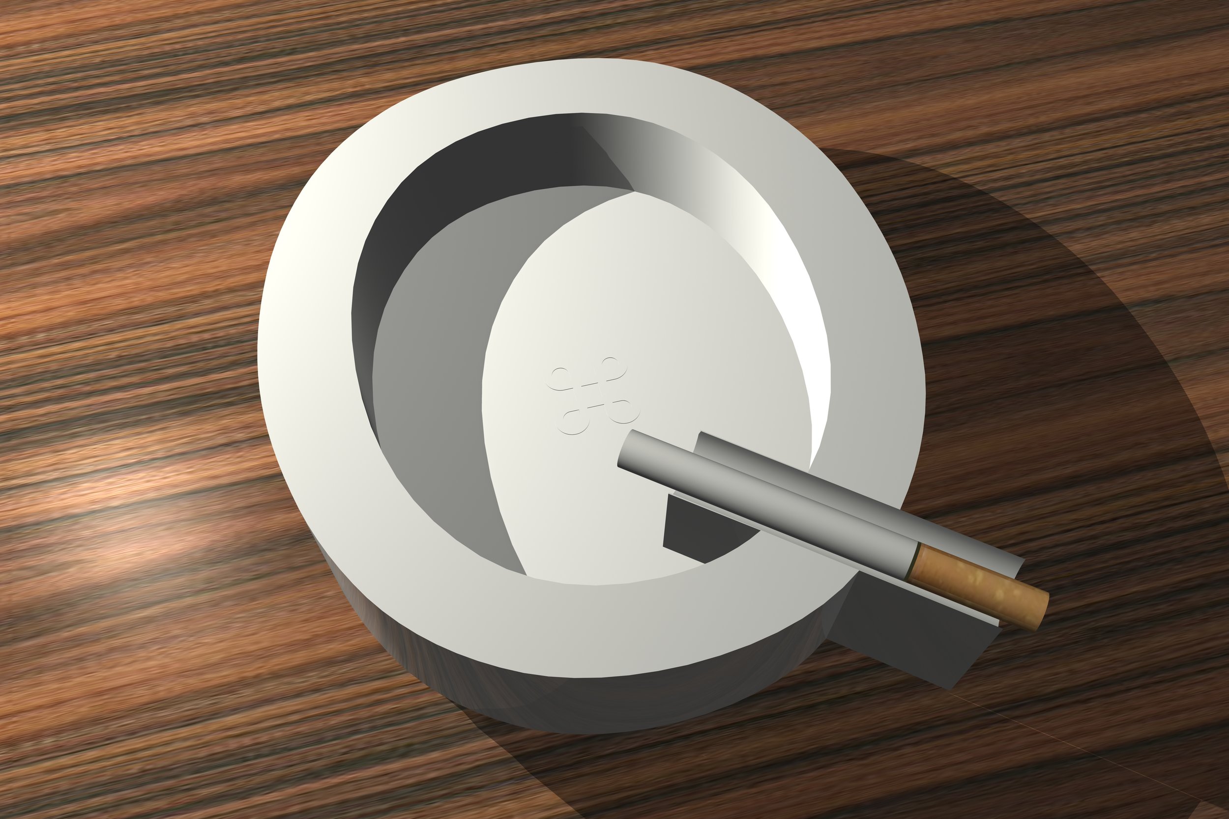
Smoking in the 21st century is an anathema. Yet, people still engage with the vice for various personal reasons. This ceramic ashtray is a critical response and is meant as a not so subtle gift to a smoker. The form of the ashtray is derived from the typeface Helvetica Q, which interestingly has an anthropomorphic look as if a cigarette is dangling from its mouth.
Helvetica, being known as the perfect font, is irresistible to the eye and upon its birth in 1957 was adopted by nearly all designers who often smoked like Mad Men. Additionally, the ashtray has a subtle command symbol in the center, in relief, that simultaneously acts as a target and the computer command reference for quitting. Therefore, every time it is used one is reminded to quit. And while this may be a work of critical or disincentive design, there's function nonetheless: the extended foot of the Q allows for an easy grasp upon emptying.