


Graphic Design
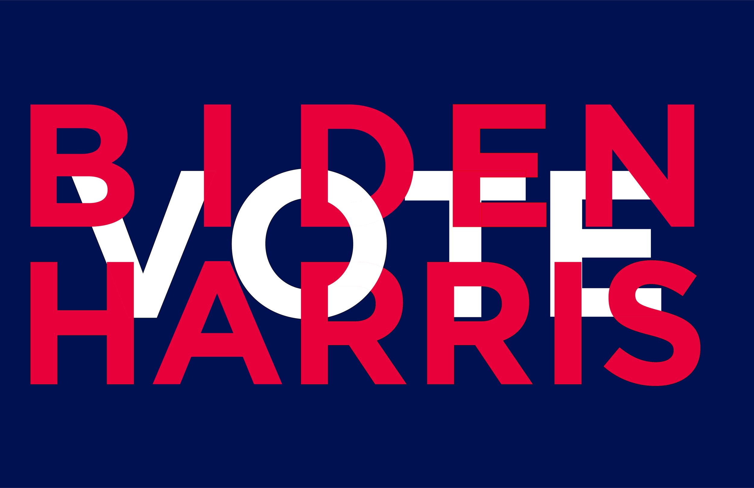
Vote: BidenHarris- A vote for Biden is a votr for Harris and vice versa. American Flag colors. Gotham Typeface. Right click/download. Print and paste up.
Salt lake city flag- The Wasatch and Oquirrh mountain ranges embrace Salt Lake City. Here, those beloved mountains are abstractly and asymmetrically positioned, but with an eye toward proportion and scale. A white strip references the snow caps as well as the winter recreational activities that attract so many people to the city. The blue references the sky and is a literal color match to the Utah state flag. The color scheme also references the sky reflected in the salt lake and the pink/red hue caused by the saline loving microorganisms. Alternatively, the white band could be seen as the lake causeway. The flag can, therefore, be read in multiple ways, all expressed in an elegant palette.
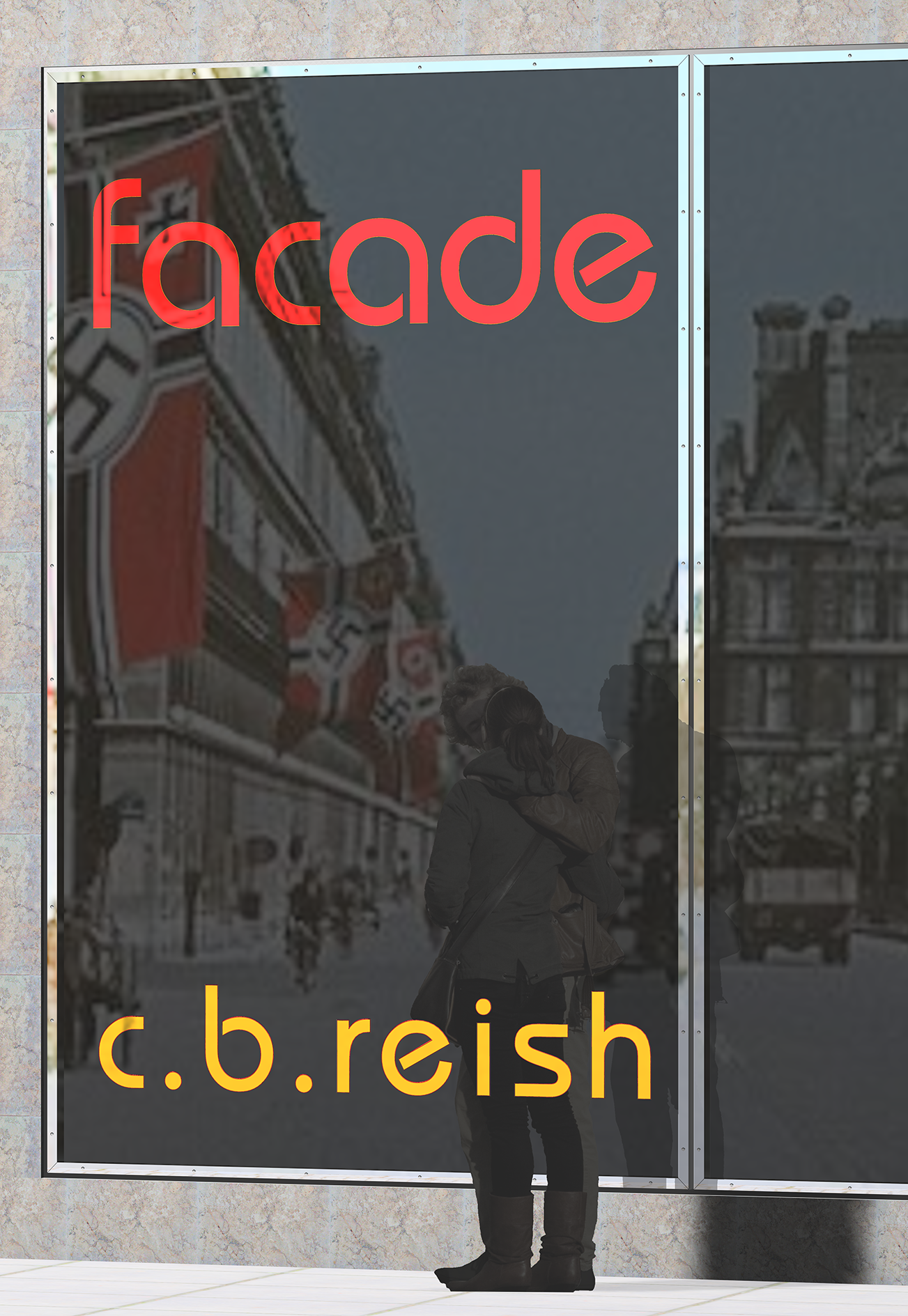
Author c.b. reish asked RethinkTANK to review a fictional account of two architecture students who fall in love at the Bauhaus in Dessau, Germany during the rise of the Third Reich. We also designed the book jacket to depict the main characters in an embrace adjacent to a modernist Miesianesque building which in turn reflects a streetscape during the era of the New Order. The fonts are from the Bauhaus and the title is in swastika metallic red and the author is in metallic gold and placed as if mounted on the glass.
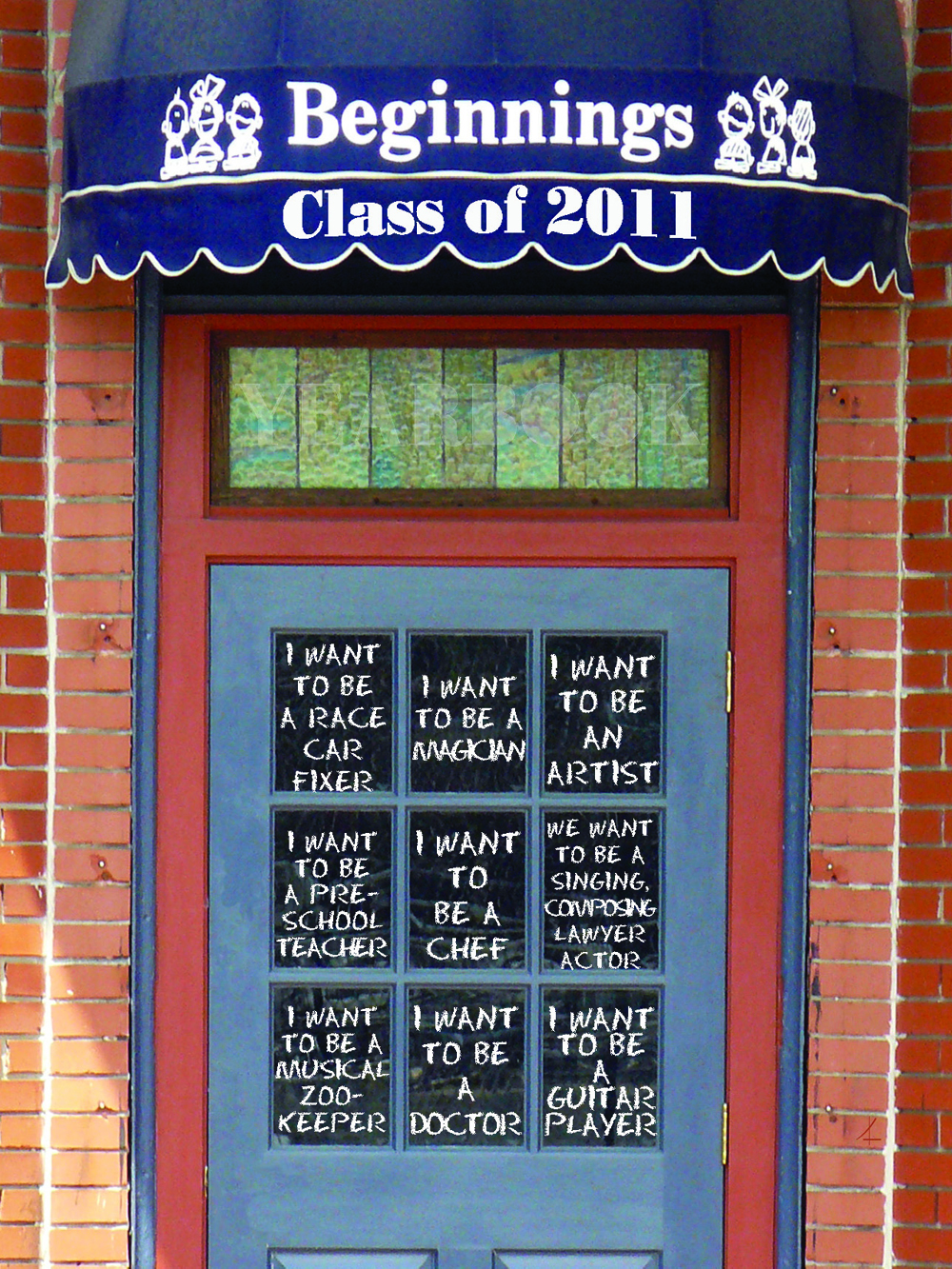
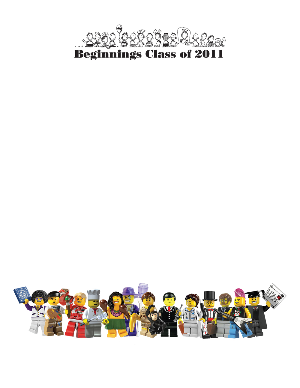
Asked to create the yearbook cover for Beginnings Preschool, RethinkTANK queried each graduate what they would like to be when they grew up. The answers were "written" on the entrance door, which served as a good metaphor to open the yearbook. The rear cover depicts each profession in a Lego mini-figure and with plenty of room to sign the book. We should check back in a score to find out if their dreams have come true.
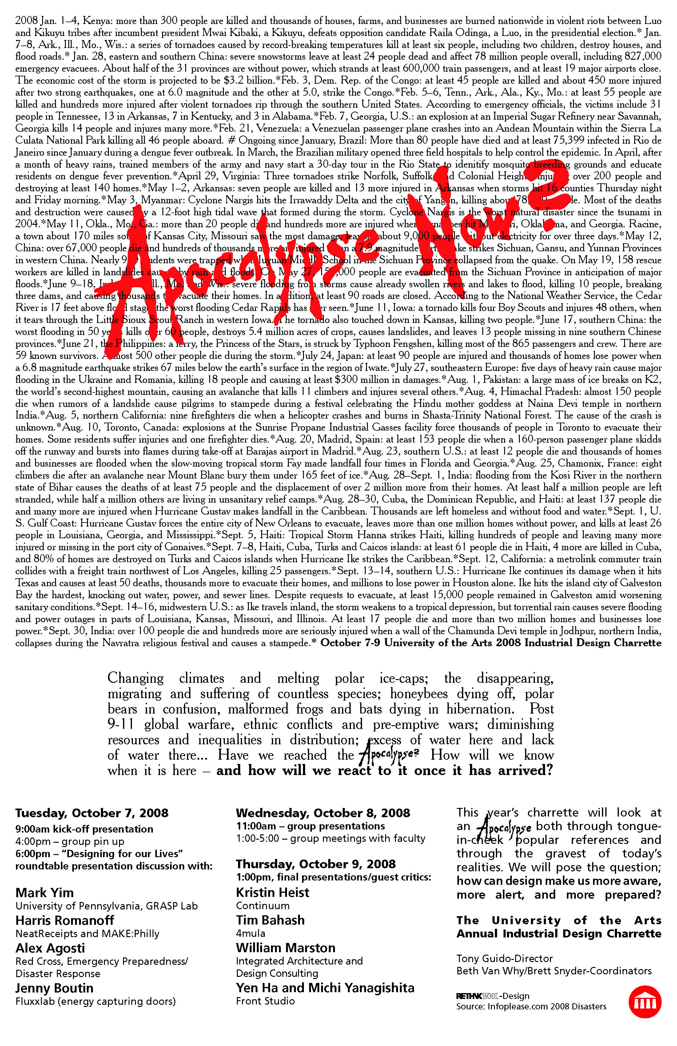
For the Industrial Design Department at The University of the Arts, RethinkTANK created the advertisement announcing the Charrette theme "Apocalypse Now?" for 2008. Using the height of the banking crisis as inspiration, the NYSE was photographed and its American flag wrapper was turned upside down. This signals distress; to put it mildly. In another advertisement, a collection of disasters for that year was densely listed with the theme title, stolen from the movie, placed within in blood red.
Prime Electric, a Canadian based service sought a new logo. The logo was inspired by a typical scene found in St. Catharines: A brown thrasher on a power line. The Thrasher is native to the area and its weight bends the wire into a slight smile.
A new logo for a Fire Alarm and Security company plays off the positive-negative. The square says reliability while the red reads "fire.
A logo and an advertisement in one for The Powerwasher
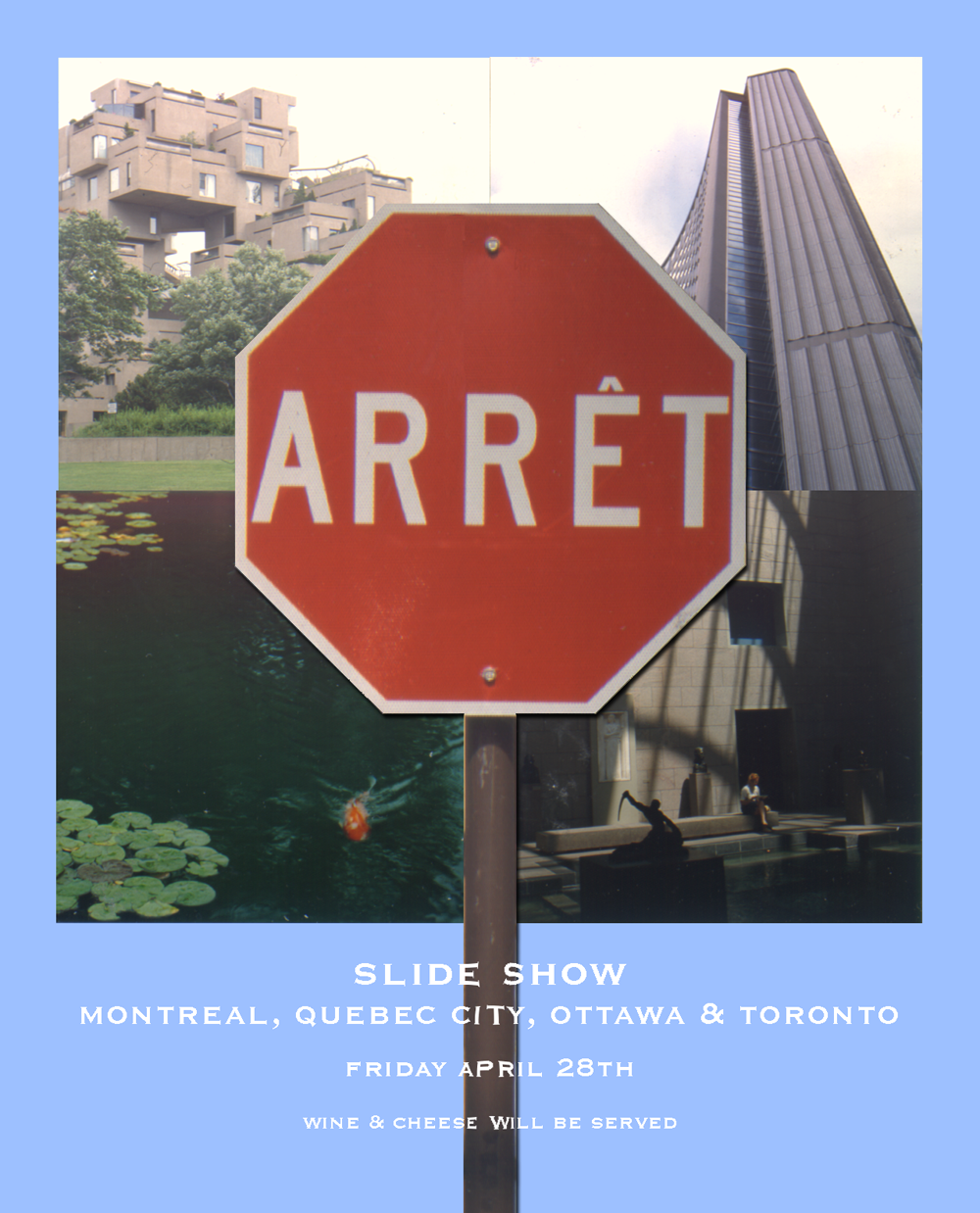
An advertisement for a lecture about Eastern Canadian architecture and design.
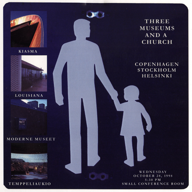
An advertisement for a lecture about Scandinavian architecture and design.